

Colour is often the first thing people notice when entering a home, yet the most successful interiors rarely depend on bold shades or dramatic contrasts. Instead, they create atmosphere through carefully balanced palettes that allow architecture, furniture, and natural materials to work together in harmony. Thoughtfully selected colours provide the foundation upon which every other design decision is built.
While seasonal trends regularly introduce new hues, timeless interiors tend to embrace colours inspired by nature. Warm whites, soft stone greys, earthy browns, muted greens, and sandy beiges create environments that feel calm, welcoming, and adaptable. These shades complement changing furniture, artwork, and decorative accessories without requiring complete redesigns every few years.
Choosing a lasting colour palette is less about following rules and more about creating spaces that continue to feel comfortable long after trends have faded.
Begin with a Calm Foundation
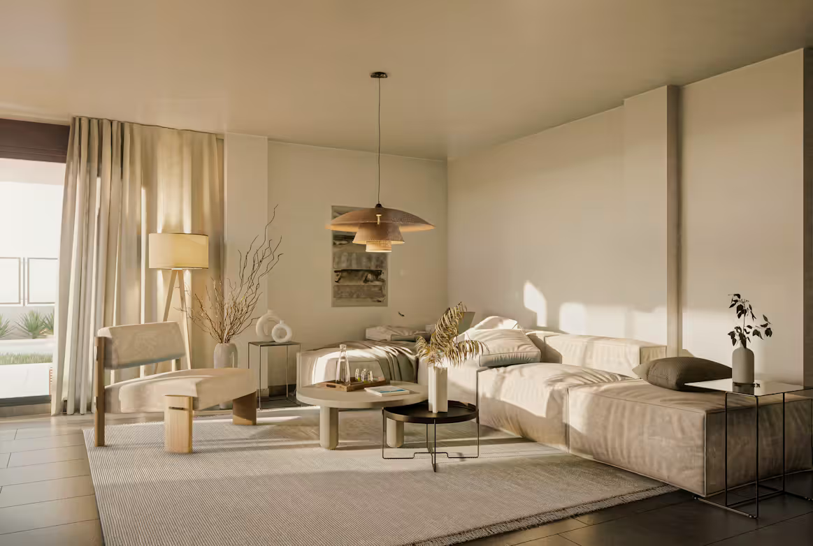
Every balanced interior starts with a restrained base palette. Walls, ceilings, and larger architectural surfaces establish the mood of the home, making them the ideal place to introduce timeless colours.
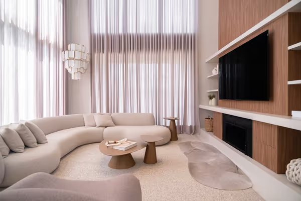
Soft whites create brightness without feeling clinical, while warm greige and subtle taupe add depth without overwhelming a room. These neutral tones reflect daylight beautifully and provide flexibility when selecting furniture and finishes.
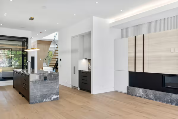
Keeping the foundation simple also allows architectural details to become more noticeable. Window frames, timber flooring, and handcrafted furniture naturally draw attention without competing against strong wall colours.
A calm backdrop creates endless opportunities for future styling while ensuring the home always feels cohesive.
Let Natural Materials Add Colour
One of the easiest ways to create depth is by allowing natural materials to introduce colour organically.
Oak flooring contributes golden warmth, walnut furniture adds richness, while limestone and travertine introduce subtle variations that cannot be replicated with paint alone. Linen, wool, leather, and rattan further enrich the palette through texture rather than bold pigmentation.
This approach creates interiors that feel layered without becoming visually busy. Instead of relying on multiple accent colours, natural materials provide quiet contrast that changes beautifully as daylight shifts throughout the day.
Because these colours originate from authentic materials, they remain timeless regardless of changing design trends.
Introduce Accent Colours Thoughtfully
Accent colours should complement the overall palette rather than dominate it. A carefully placed olive green chair, rust-coloured cushions, or deep blue artwork can introduce personality while maintaining visual balance.
Designers often repeat accent colours subtly throughout a room to create continuity. A ceramic vase may echo the colour of a cushion, while artwork reflects tones found within a woven rug.
This measured repetition creates harmony without making interiors feel overly coordinated. By limiting the number of accent colours, each one carries greater impact while preserving the calm atmosphere established by the neutral foundation.
Less often achieves far more than constantly introducing new shades.
Light Changes Every Colour
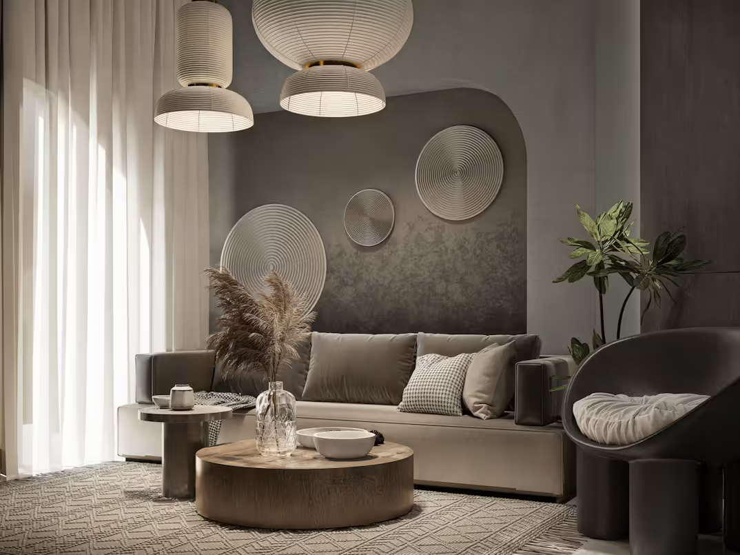
No colour exists independently of light. Morning sunlight, afternoon brightness, and evening illumination each influence how walls, furniture, and textiles appear.
Rooms facing north may benefit from warmer neutral tones that counter cooler daylight, while south-facing interiors often accommodate a wider range of subtle colours thanks to abundant natural light.
Artificial lighting also deserves careful consideration. Warm lighting enhances timber, natural stone, and earthy colours, creating welcoming spaces during the evening. Cooler lighting, on the other hand, can make otherwise comfortable interiors feel less inviting.
Testing colours under different lighting conditions helps ensure they remain beautiful throughout the day and across changing seasons.
Build a Palette That Evolves Gracefully
Timeless homes are designed to evolve rather than remain static. A carefully considered colour palette provides the flexibility to introduce new artwork, textiles, furniture, and decorative accessories without disrupting the overall composition.
Seasonal styling becomes effortless when the foundation remains neutral. Linen textiles and fresh greenery brighten interiors during spring and summer, while wool throws, darker ceramics, and textured cushions introduce warmth during autumn and winter.
This adaptability allows homeowners to refresh their spaces naturally while preserving the architectural integrity of the design.
Rather than chasing colour trends, investing in a lasting palette creates interiors that continue to feel elegant year after year.
Final Thoughts
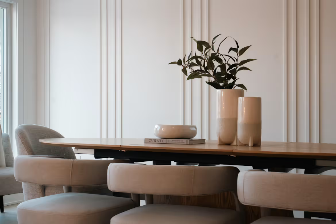
Colour has the power to influence how every room feels, but timeless interiors rarely rely on dramatic statements. Instead, they achieve lasting beauty through balanced neutrals, authentic materials, and carefully considered accent colours that support rather than dominate the space.
By creating a calm foundation and allowing texture, craftsmanship, and natural light to add richness, homeowners can design interiors that remain both adaptable and sophisticated. As personal tastes evolve, the colour palette continues to support new ideas without losing its timeless appeal.
The most enduring homes remind us that colour is most powerful when it enhances the architecture rather than competing with it.



Comments